
I was very hesitant to do one of these painting events because I am not a very good artist yet I am somewhat of a perfectionist. I was dreading taking home something that didn’t turn out to be very good. Heather assured me Kristine was very helpful and gave great directions. It really didn’t put me at ease but since I was willing to do anything once, I put my fears aside and decided to give it a whirl.
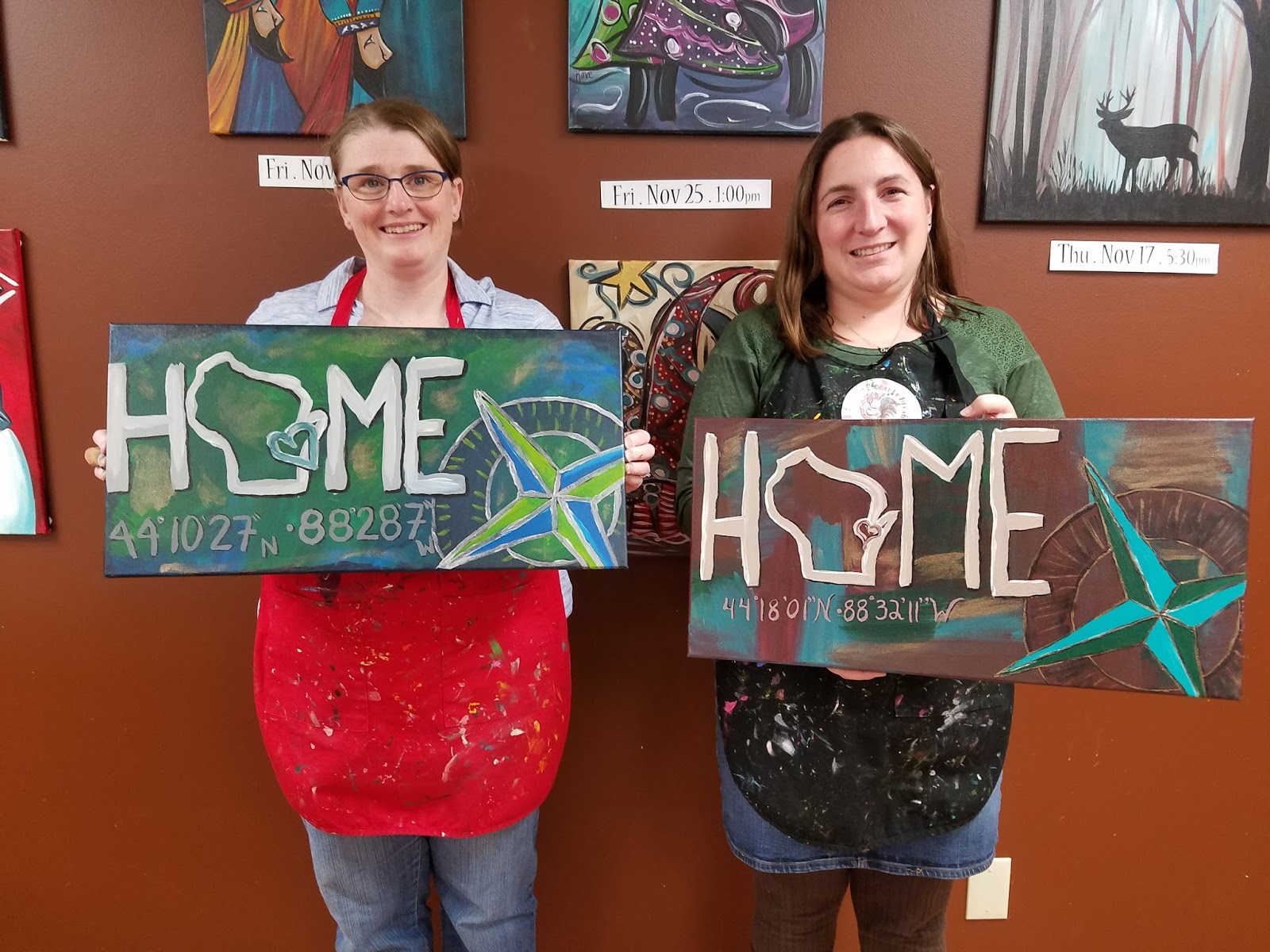
After grabbing dinner and a snack to bring with us at Q’doba, we head downtown to the Marketplace and Rooster Dreams. We get upstairs and settle in just before it was to start. I was expecting everyone to do the same painting with very little personalization but I was mistaken. We were told to pick out 4 colors we want to use as our background. I went with a lighter blue, a darker blue, a dark green, and a mustard yellow.

Kristine would show us what to do on the canvas before letting us do it which helped immensely since I need that visual. Our firs take was to make a patchwork quilt of color on our canvas. I started with the yellow and moved into the blues and greens. This was my first mistake. I should have started with one of the darker colors so when I started to blend and layer, the blue or green would not have stood out as much as the yellow did or turn to green as the yellow and blue did. Because I wasn’t happy with the bright yellow splotches mixed with the darker blues and greens, I smeared the yellow into the blues and to make more of green. Some of the yellow showed through but it gave it more of a blueish-green background that didn’t look bad.

Once we had the background painted (and dry) it was time to move onto the letters and compass. I was slightly apprehensive about having to draw the compass and the state of Wisconsin but Kristine quickly calmed my fears by passing out Wisconsin stencils and rulers and circles for the compass. It’s okay to cheat in the design of good art. I had no problems with the letters. The compass on the other hand really gave me trouble. The circles were easy the arrows were too much for my feeble mind to grasp or something. They did not line up properly. Luckily Heather and Kristine were there to rescue me and helped me realign my lines so they went to the correct points.

Painting the letters wasn’t that difficult. I had some difficulty adding dimension but they came out alright. Freehanding the latitude and longitude wasn’t horrible except I made the numbers too big and the 8s were a bit of a challenge. The compass still wasn’t being my friend though. I had a lot of trouble getting the arrows to have dimension partially because they didn’t line up exactly right. The other “issue” I had was the border of my compass was too dark in my opinion. I was told we can fix that with metallic paint and it was. The silver metallic greatly helped my compass and the gold added an extra layer to the background.


Overall I was pretty satisfied with how it turned out and the hubby wanted to know if we could frame it. I told him we could hang it up without being frame. He said it almost looked professional… I wouldn’t go THAT far.

Would I do it again? You bet. However, it just has to be when it’s in the budget as Kristine doesn’t accept cards just cash and checks. I’d love to get a group of friends together and all of us go paint. As much as I would love to do a winter scene, I’m thinking the budget says we need to wait until spring. I will be definitely be painting again. It may be one of those things that I do often enough that I run out of room to hang my paintings.
No comments:
Post a Comment